- Home
- About
- Courses
- Artificial Intelligence(AI) and Machine Learning(ML), Robotic
- Artificial Intelligence
- Prompt Engineering
- AI Engineer
- AI Architect
- AI IAM Architect
- Generative AI Security Engineer
- AI-Powered Digital Forensics & SOC Analyst
- AI Cloud Engineering Specialist
- NLP Engineer – Transformers Specialist
- AI Full Stack Developer
- AI Content Architect
- Deep Learning Engineer with TensorFlow & PyTorch
- AI Ethics and Governance Specialist
- AI for Business & Strategy
- Governance, Risk & Compliance (GRC) Engineer
- Machine Learning
- Artificial Intelligence
- Cyber Security
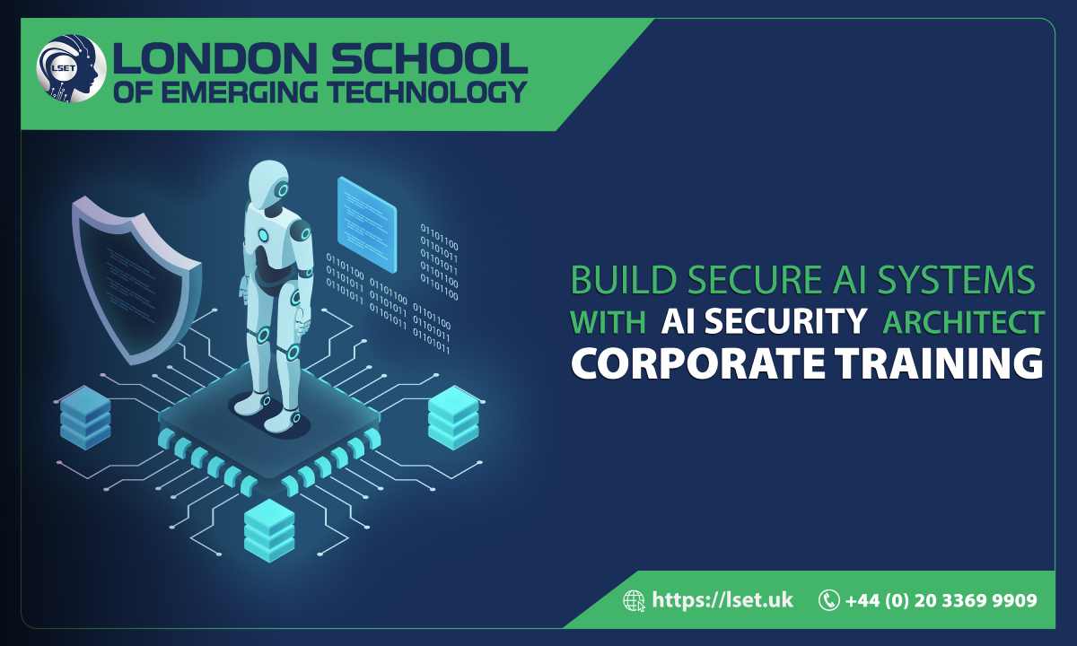
- AI Security Architect
- Cyber Security Engineer
- AI Cybersecurity Engineer
- AI-Augmented Ethical Hacker
- Fundamentals and Advanced Techniques
- Architecture and Design
- Operations and Incident Response
- Governance, Risk, and Compliance
- Threat Intelligence and Analytics
- Leadership and Strategic Management
- Network Security
- Ethical Hacking and Penetration Testing
- AI Threat Detection & Incident Response Engineer
- Specialised Security Areas
- Awareness and Training
- Enterprise Software
- Cloud Computing
- Data Science and Data Engineering
- Blockchain
- Business Management
- Digital Marketing
- Mobile Development
- eGovernance
- Game Development and Augmented Design
- Innovation and Product Development
- Quantum Computing
- Artificial Intelligence(AI) and Machine Learning(ML), Robotic
- Programs
- Admissions
- BusinessHub
- JobHub
- Events