What is PCA? #
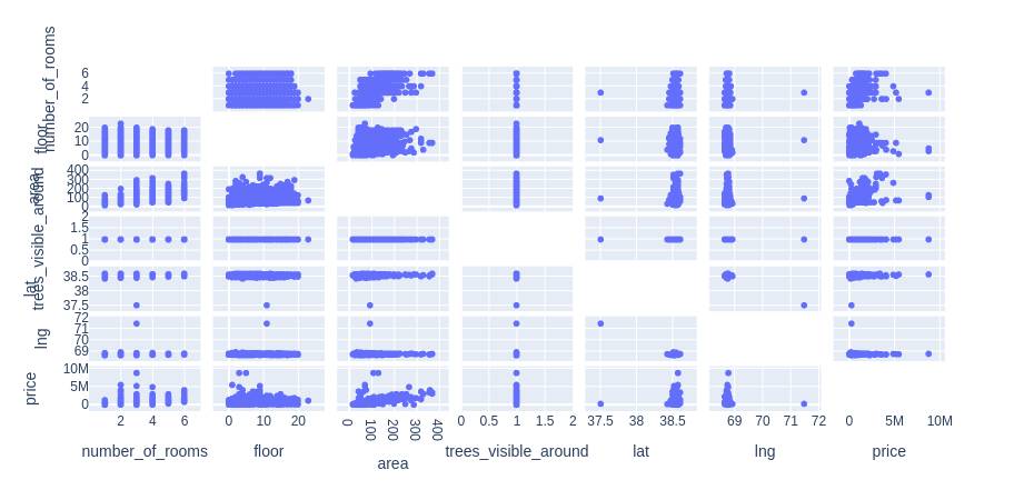
Principle component analysis is a dimensionality reduction technique mainly used in exploratory data analysis. It is used while working with data that has many features to find out the importance of the features (principal components) and pick the features with the highest importance and ignoring the rest of the features. For example, in the table below the variable “trees_visible_around” does not have any relation with the price. Thus, for creating any model we can disregard it.
| number_of_rooms | floor | area | trees_visible_around | lat | lng | price | |
| 0 | 1 | 1 | 58.0 | 1.0 | 38.585834 | 68.793715 | 330000 |
| 1 | 1 | 14 | 68.0 | 1.0 | 38.522254 | 68.749918 | 340000 |
| 3 | 3 | 14 | 84.0 | 1.0 | 38.520835 | 68.747908 | 700000 |
| 4 | 3 | 3 | 83.0 | 1.0 | 38.564374 | 68.739419 | 415000 |
| 5 | 3 | 4 | 53.0 | 1.0 | 38.530686 | 68.745261 | 513000 |
Also, we can find the relation between different variables and from the visuals make up our mind which features to pick and which ones to disregard.
df = pd.read_csv("estate_data.csv")
import plotly.express as px
# features of the data
features = ["number_of_rooms","floor","area","trees_visible_around","lat","lng","price"]

# ploting scattere graph fo each attribute
fig = px.scatter_matrix(
df,
dimensions=features,)
# ploting the graph
fig.update_traces(diagonal_visible=False)
fig.show()
Output:
How is PCA implemented? #
Now let us have a look at a problem to dismantle the math behind PCA. Let us say we have a dataset with some samples and variables as shown below.
| v1 | v2 | v3 | v4 | |
| S1 | 10.0 | 6.0 | 12.0 | 5.0 |
| S2 | 11.0 | 4.0 | 9.0 | 7.0 |
| S3 | 8.0 | 5.0 | 10.0 | 6.0 |
| S4 | 3.0 | 3.0 | 2.5 | 2.0 |
| S5 | 2.0 | 2.8 | 1.3 | 4.0 |
| S6 | 1.0 | 1.0 | 2.0 | 7.0 |
First, let us consider only the first variable and create our graph. For plotting our data we will use plotly python library.
import plotly.graph_objects as go
import numpy as np
fig = go.Figure()

fig.add_trace(go.Scatter(
    x=data.v1.values, y=np.zeros(len(data.v1.values)),text=data.index.values, mode='text', marker_size=20,textposition='top center'
))

fig.update_xaxes(showgrid=False)
fig.update_yaxes(showgrid=False,
                 zeroline=True, zerolinecolor='black', zerolinewidth=3,
                 showticklabels=False)
fig.update_layout(height=250, plot_bgcolor='white')
fig.show()
Output:
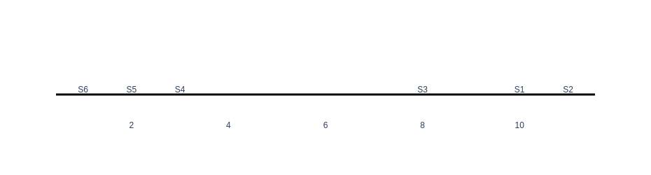
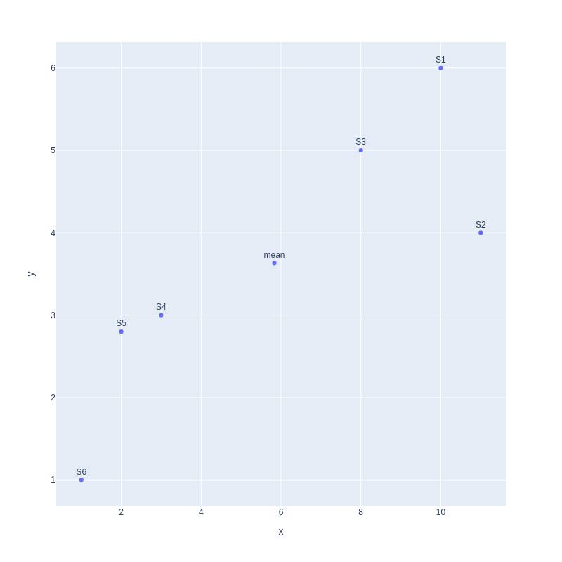
As can be seen in the graph, there are two clusters of samples, one on the left with samples (S6,S5,S4) and the other on the right with samples (S3,S1,S2). Now, let’s plot our data using two variables of v1 and v2.
import plotly.express as px
fig = px.scatter(x=data.v1.values,y=data.v2.values,text=data.index.values,width=800, height=800)
fig.update_traces(textposition='top center')
fig.show()
Output:
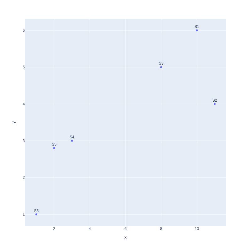
Still, we can observe that our data has two clusters, one on the left and another on the right. Moving on we can plot data with three variables as well.
import plotly.express as px
fig = px.scatter_3d(x=data.v1.values, y=data.v2.values, z=data.v3.values,text=data.index.values)
fig.show()
Output:

With 3d visualization, we can still observe the cluster in our data and can make conclusions on the correlation between the variables. Now if we want to find the relation between more than three variables it becomes mind-blowing. This is where principal components come in handy.
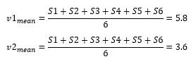
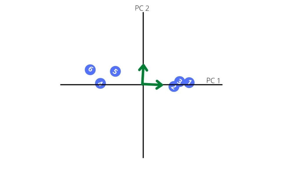
To know how to find principal components, let us continue with our 2D plot. First, we find the mean point for our graph.
Second, we move the mean to the center of the coordinate.
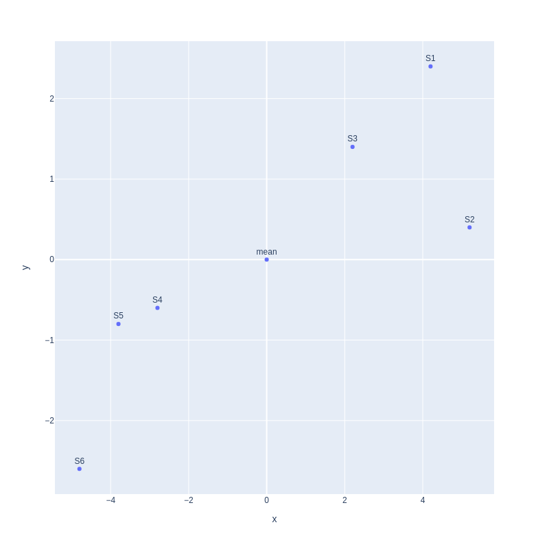
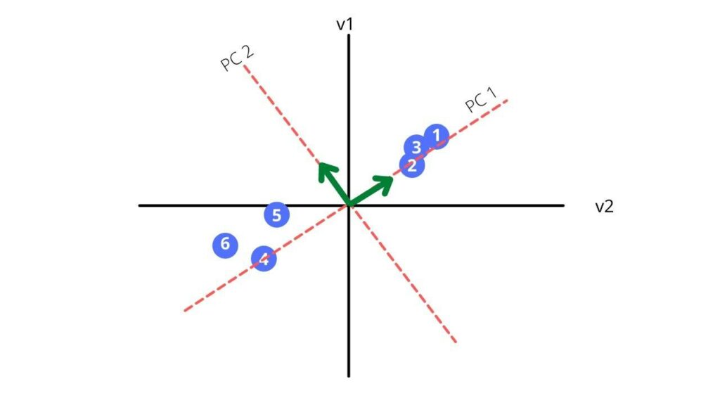
Third, we find a line that best fits the scatterplot. That line will be our principal component1 or PC1.
Now let us find the hypotenuse of the triangle.
√((1^2+4^2 ) )= 4.12
For the above vector we will create an unite vector.
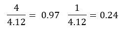
We received a new vector of 0.97i + 0.24j which is also called our eigen vector. The sum of distances for PC1 is called the eigenvalues for PC1 and the square root of the eigen value is called the singular value for PC1.
Our PC2 is perpendicular to our PC1. Thus, the equation is simply
0.97i – 0.24j
Now, we rotate our principal components to get a new coordinate plane
The other characteristic of our principal component is variation for the principal component which calculated for each principal component by dividing the eigenvalue by the number of samples minus one.

The above plot shows how much each principal component defines the dataset.
Now let us say we have a dataset with three variables, and we find the principal component for each of them and lastly get the below screen plot.

From the above plot we can conclude that plotting our data using only PC1 and PC2 can give a relatively accurate result as it captures around 99% of the whole variation.
In this way we can always plot the variation of the principal components and pick the significant ones that are more representative of the data, thus reducing the dimensions of our dataset.
Using PCA to compress image #
In this section we are going to see the application of PCA in compressing images. First, we start with analyzing the image of a horse. Using opencv we open the image as a 3D array.
# importing the necessary libraries
import cv2
import matplotlib.pyplot as plt
from sklearn.decomposition import PCA

# Reading the data as a numpy array
original_image = cv2.cvtColor(cv2.imread('image.jpg'), cv2.COLOR_BGR2RGB)

# showing the original image
plt.imshow(original_image)
plt.show()
Output:

Our array represents the three channels of color and has the following shaple
print(original_image.shape)Output:
(810, 1080, 3)
Now we can split the image into three separate layers each representing a channel and display them
#Splitting into three channels
b,g,r = cv2.split(original_image)


# Creating space for the three images to fit
fig = plt.figure(figsize = (15, 7.2))

# blue colored image
fig.add_subplot(131)
plt.title("Blue Channel")
plt.imshow(b)

# Green colored image
fig.add_subplot(132)
plt.title("Green Channel")
plt.imshow(g)

# Red colored image
fig.add_subplot(133)
plt.title("Red Channel")
plt.imshow(r)
plt.show()
Output:

Now we can explore each layer on its own by finding its shape.
# printing the shape  of each layer
print(b.shape)
print(r.shape)
print(g.shape)
Output:
(993, 1000)
(993, 1000)
(993, 1000)
Now that we have each layer, let us scale them and apply PCA on them and retain fifty principal components.
# scalling the matrix values in between 0, 1

df_blue = b/255
df_green = g/255
df_red = r/255

# PCA with 50 components for blue matrix
pca_b = PCA(n_components=50)
pca_b.fit(df_blue)
trans_pca_b = pca_b.transform(df_blue)

# PCA with 50 components for green one
pca_g = PCA(n_components=50)
pca_g.fit(df_green)
trans_pca_g = pca_g.transform(df_green)

# PCA with 50 component for the red one
pca_r = PCA(n_components=50)
pca_r.fit(df_red)
trans_pca_r = pca_r.transform(df_red)

# printing the shapes of the matrix
trans_pca_b.shape
trans_pca_r.shape
trans_pca_g.shape
Output:
(993, 50)
(993, 50)
(993, 50)
Now lets see how much of the variation is covered by 50 principal components.
# printing the varinace percentage
print(f"Blue Matrix : {sum(pca_b.explained_variance_ratio_)}")
print(f"Green Matrix: {sum(pca_g.explained_variance_ratio_)}")
print(f"Red Matrix  : {sum(pca_r.explained_variance_ratio_)}")
Output:
Blue Matrix: 0.951348178309625
Green Matrix: 0.9350084822730234
Red Matrix: 0.9297422547372972
As we can see even after selecting only 50 principal components still more than 80 % of the variation is retained in the updated dataset. Now let us redraw the image from our compressed data.
# Reversing the transfrom
blue_arr = pca_b.inverse_transform(trans_pca_b)
green_arr = pca_g.inverse_transform(trans_pca_g)
red_arr = pca_r.inverse_transform(trans_pca_r)

# merging the reduced separated matrices
img_reduced= (cv2.merge((blue_arr, green_arr, red_arr)))
fig = plt.figure(figsize = (10, 7.2))

# Origional image
fig.add_subplot(121)
plt.title("Original Image")
plt.imshow(original_image)

# Reduced image
fig.add_subplot(122)
plt.title("Reduced Image")
plt.imshow(img_reduced)
plt.show()
Output:

Comparing the two images, we can see that the principal component array also gives us enough information to redraw our image.
Using PCA to compress numeric data in Python #
In this section we are going to use PCA to compress our dataset to prepare it for model training. For this section we will be using a built-in sklearn dataset called digits.
import pandas as pd
from sklearn.datasets import load_digits
dataset = load_digits()
dataset.keys()
Output:
dict_keys([‘data’, ‘target’, ‘frame’, ‘feature_names’, ‘target_names’, ‘images’, ‘DESCR’])
Looking at the shape of the independent variables (data), we can see that it has 64 features and not all the columns may be useful for machine learning algorithms.
dataset.data.shapeOutput:
(1797, 64)
We can also look at a single observation to make sense of how the data looks like. So, eachobservation has the value of each pixel in our image. As our image is 64 pixels, it has 64 variables each ranging from 0 to 255.
dataset.data[0]Output:
array([ 0.,  0.,  5., 13.,  9.,  1.,  0.,  0.,  0.,  0., 13., 15., 10.,
       15.,  5.,  0.,  0.,  3., 15.,  2.,  0., 11.,  8.,  0.,  0.,  4.,
       12.,  0.,  0.,  8.,  8.,  0.,  0.,  5.,  8.,  0.,  0.,  9.,  8.,
        0.,  0.,  4., 11.,  0.,  1., 12.,  7.,  0.,  0.,  2., 14.,  5.,
       10., 12.,  0.,  0.,  0.,  0.,  6., 13., 10.,  0.,  0.,  0.])
Now let us change the shape of our array and plot it as an image.
dataset.data[0].reshape(8,8)Output:
array([[ 0.,  0.,  5., 13.,  9.,  1.,  0.,  0.],
       [ 0.,  0., 13., 15., 10., 15.,  5.,  0.],
       [ 0.,  3., 15.,  2.,  0., 11.,  8.,  0.],
       [ 0.,  4., 12.,  0.,  0.,  8.,  8.,  0.],
       [ 0.,  5.,  8.,  0.,  0.,  9.,  8.,  0.],
       [ 0.,  4., 11.,  0.,  1., 12.,  7.,  0.],
       [ 0.,  2., 14.,  5., 10., 12.,  0.,  0.],
       [ 0.,  0.,  6., 13., 10.,  0.,  0.,  0.]])
import matplotlib.pyplot as plt
plt.gray()
plt.matshow(dataset.data[0].reshape(8,8))Output:

Above we can see the image which, created based on the 2D array. Before doing any operation on our data it is always a good idea to scale our data. Because different variables might have different range and this may cause distortion while making any prediction.
df = pd.DataFrame(dataset.data,columns=dataset.feature_names)
X = df
y = dataset.target

from sklearn.preprocessing import StandardScaler

scaler = StandardScaler()
X_scaled = scaler.fit_transform(X)
X_scaled
Output:
array([ 0.        , -0.33501649, -0.04308102,  0.27407152, -0.66447751,
       -0.84412939, -0.40972392, -0.12502292, -0.05907756, -0.62400926,
        0.4829745 ,  0.75962245, -0.05842586,  1.12772113,  0.87958306,
       -0.13043338, -0.04462507,  0.11144272,  0.89588044, -0.86066632,
       -1.14964846,  0.51547187,  1.90596347, -0.11422184, -0.03337973,
        0.48648928,  0.46988512, -1.49990136, -1.61406277,  0.07639777,
        1.54181413, -0.04723238,  0.        ,  0.76465553,  0.05263019,
       -1.44763006, -1.73666443,  0.04361588,  1.43955804,  0.        ,
       -0.06134367,  0.8105536 ,  0.63011714, -1.12245711, -1.06623158,
        0.66096475,  0.81845076, -0.08874162, -0.03543326,  0.74211893,
        1.15065212, -0.86867056,  0.11012973,  0.53761116, -0.75743581,
       -0.20978513, -0.02359646, -0.29908135,  0.08671869,  0.20829258,
       -0.36677122, -1.14664746, -0.5056698 , -0.19600752])
Now we can see that our data is scaled to a certain scale. Now let us train a model a calculate its accuracy score.
from sklearn.model_selection import train_test_split
X_train, X_test, y_train,y_test = train_test_split(X_scaled,y,test_size=0.2,random_state=30)
from sklearn.linear_model import LogisticRegression
model = LogisticRegression()
model.fit(X_train,y_train)
model.score(X_test,y_test)
Output:
0.9722222222222222
As we can see from the above output the accuracy of the model is quite high. Now let us first perform PCA on our dataset to pick the principal components which stand for 95 percent of the variation and see how the shape of our dataset changes.
from sklearn.decomposition import PCA
pca = PCA(0.95)

x_pca = pca.fit_transform(X)
x_pca.shape
Output:
(1797, 29)
As we can see now, we have 29 principal components and still they cover 95 percent variation. We can also check the variance of each principal component.
pca.explained_variance_ratio_Output:
array([0.14890594, 0.13618771, 0.11794594, 0.08409979, 0.05782415,
       0.0491691 , 0.04315987, 0.03661373, 0.03353248, 0.03078806,
       0.02372341, 0.02272697, 0.01821863, 0.01773855, 0.01467101,
       0.01409716, 0.01318589, 0.01248138, 0.01017718, 0.00905617,
       0.00889538, 0.00797123, 0.00767493, 0.00722904, 0.00695889,
0.00596081, 0.00575615, 0.00515158, 0.0048954 ])pca.n_components_Output:
29
We can see the principal components with a variation of 14% to 0.4 percent are considered and the rest is of a very trivial importance. Now let us train our model with the principal components.
X_train_pca, X_test_pca, y_train,y_test = train_test_split(x_pca,y,test_size=0.2,random_state=30)
X_train_pca

model = LogisticRegression(max_iter=1000)
model.fit(X_train_pca, y_train)
model.score(X_test_pca,y_test)
Output:
0.9694444444444444
The accuracy is almost the same. But it is also important to keep most of the significant principal components. For example, if we take only two principal components the accuracy of our model will decrease significantly.
pca = PCA(n_components=2)
x_pca = pca.fit_transform(X)
X_train_pca, X_test_pca, y_train,y_test = train_test_split(x_pca,y,test_size=0.2,random_state=30)
model = LogisticRegression(max_iter=1000)
model.fit(X_train_pca, y_train)
model.score(X_test_pca,y_test)
Output:
0.6083333333333333
Summary #
In this article, we went through the main ideas behind principal component analysis. We also learnt how to use PCA to reduce the dimension of our dataset and keep the important features. Lastly, we applied PCA on an image to reduce its features and recreate it from the principal components.
A complete copy of the source code can be found on GitHub Principal Component Analysis


